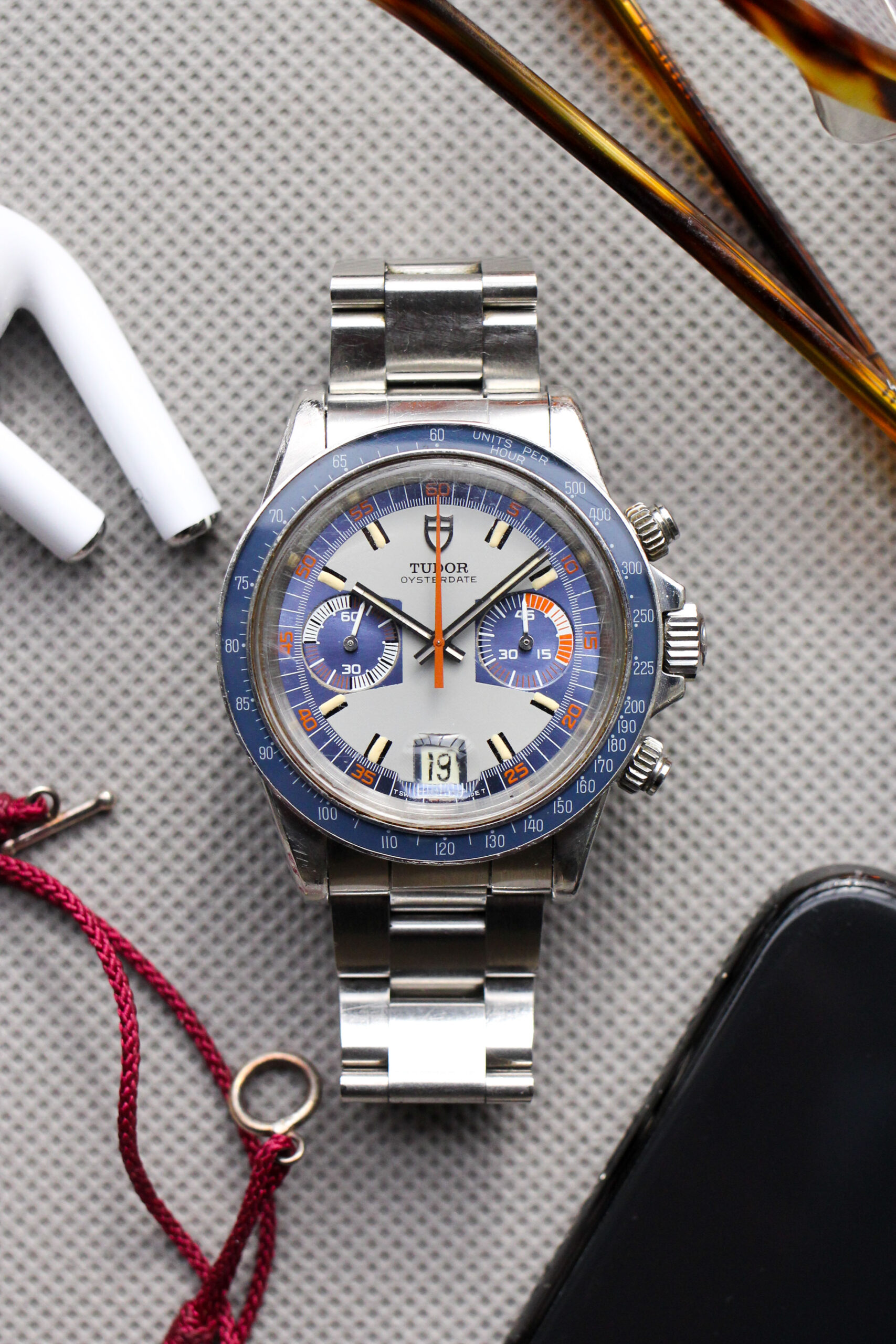
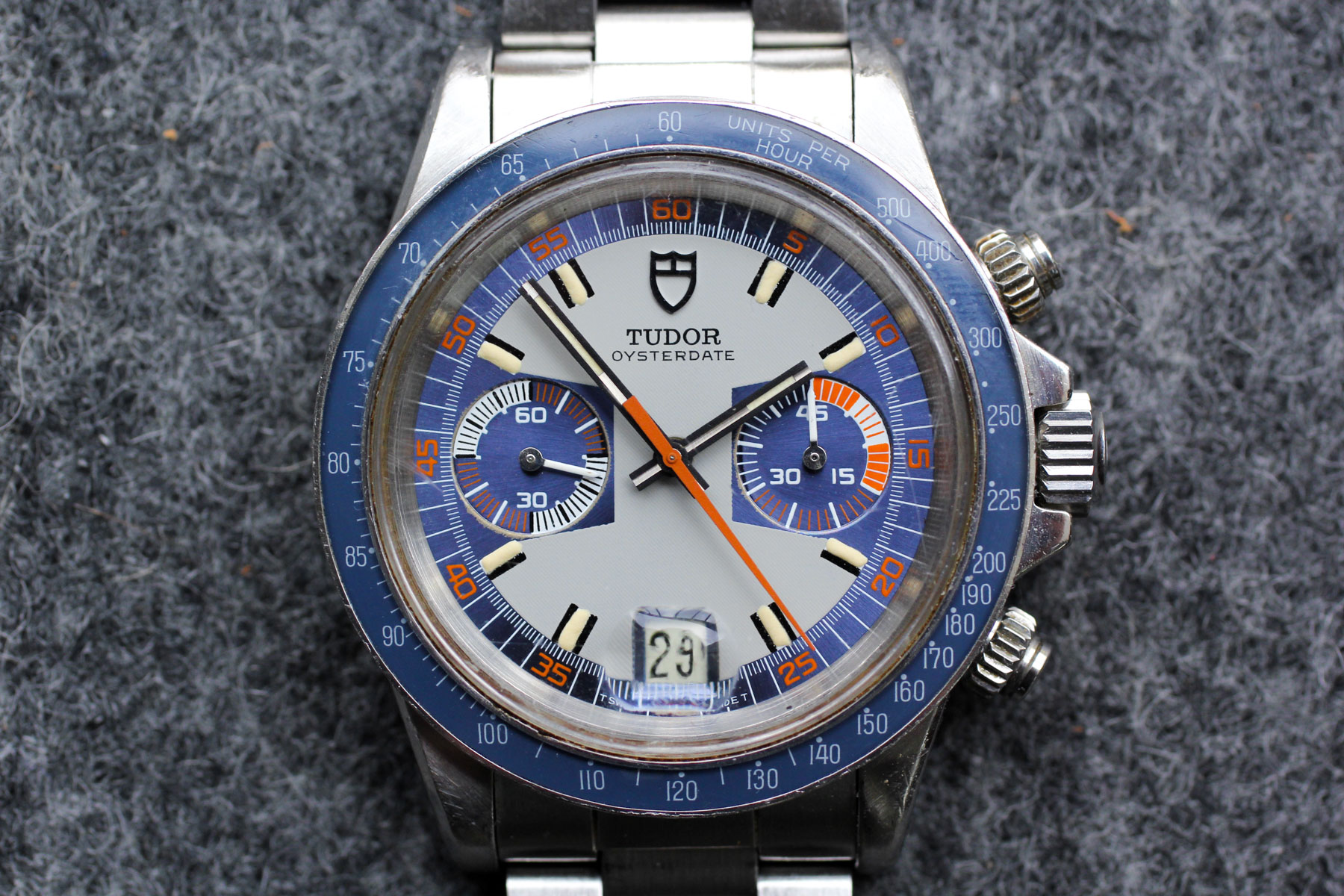
The Tudor Monte Carlo 7149 and I go way back. In fact, the entire reason I own this stunning exotic chronograph today can be traced back to the most unlikely of objects: a two-tone Tag Heuer Professional from the 1990s.
The year was 2013, and at the time, my only watch was a two-tone quartz Tag Heuer that was handed down from my father. Children of the 80’s probably remember those Tag Heuers well, as they were everywhere and they had a penchant for ripping out as much arm hair as they could snag in their twisted bracelet links. I didn’t connect with the Tag, but I dutifully wore it daily, my arm hair becoming sparser with each passing day.
One morning while eating breakfast, I flipped through an issue of National Geographic Traveler and immediately stopped on a full page advertisement for the Tudor Heritage Chronograph. The design was bold and colorful, and subconsciously I could see a design connection to Rolex. I wanted the watch, but something felt wrong. I didn’t need a new watch. Plus I wasn’t ready to consider a purchase that large without doing my homework first.
Within days, I had consumed everything I could about the Heritage Chrono (such as this super early HODINKEE video!) and unexpectedly felt a much stronger pull towards the vintage models that served as the direct inspiration for the Heritage Chrono. The original design seemed cleaner, with finer details on the dial, smaller proportions, and unique patina on each individual example that I saw for sale. There was a “story” to each example, which made the modern incarnation feel sterile in comparison.
This horological crash course led to a true “light bulb moment” for me – the realization that I didn’t have to wear something out of duty, and instead could buy anything I was drawn to and could afford. And even further, it didn’t have to be new! This realization didn’t seem like much at the time, but I would soon owe my entire sprawling watch collection to that light bulb moment with the Heritage Chrono.
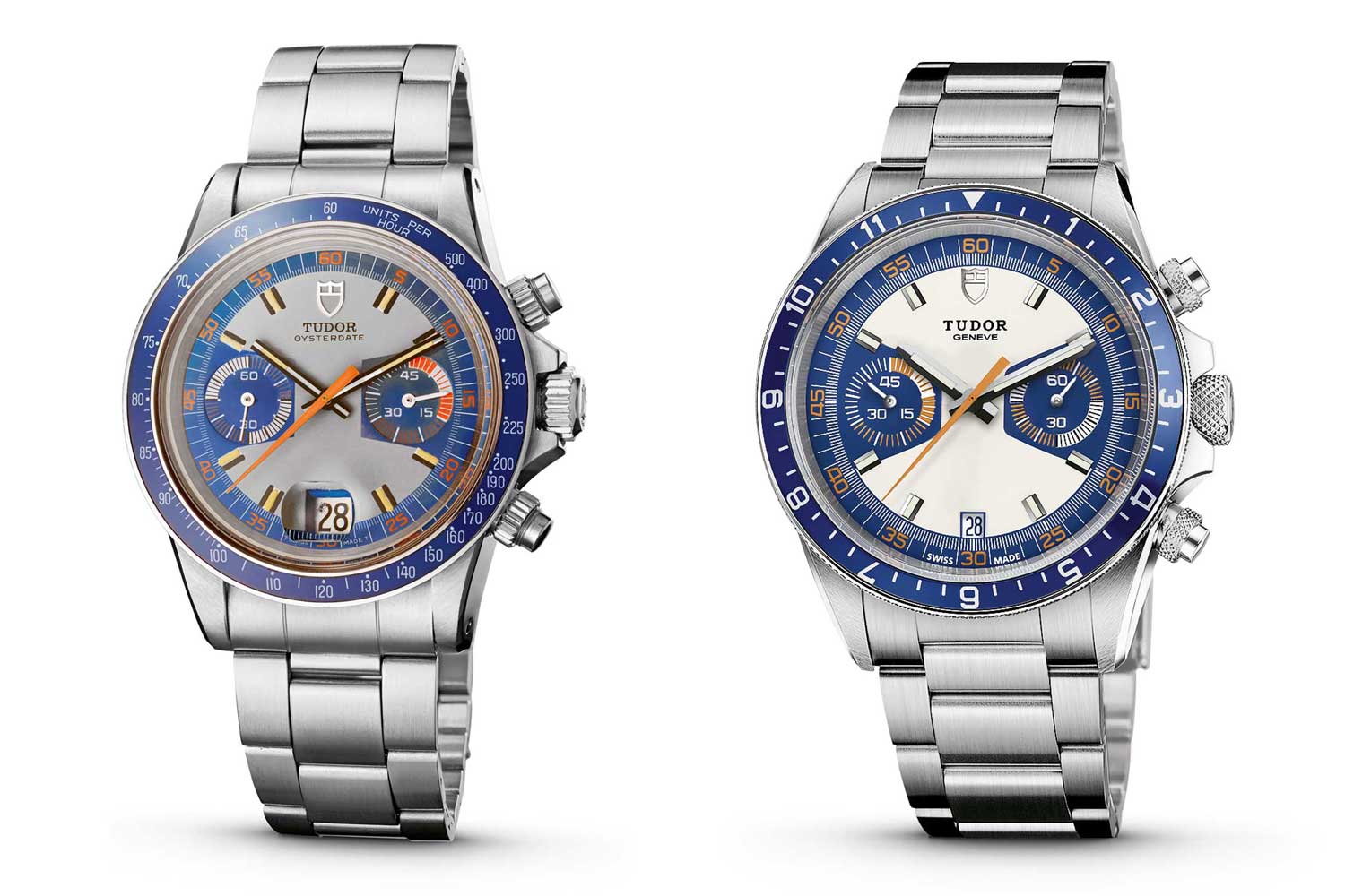
c/o Revolution Watch
Wearability
A frequent discussion topic related to the Tudor Monte Carlo is why it hasn’t enjoyed an eye-watering rise in prices on par with Paul Newman Daytonas (on a percentage basis), particularly given the resurgence of Tudor’s brand in recent years.
Often, I hear people blame the Monte Carlo’s less impressive price trajectory on its proportions, saying that “they’re too big and bulky” and “don’t feel refined like the Daytona.” This could not be further from the truth, in my mind, and is often touted by people who confuse early Monte Carlos with the later Big Block references.
To be more specific, the first two iterations of Tudor’s exotic chronograph line had a diameter of 39.5mm and a thickness of~12.8mm. In comparison, the modern Rolex Daytona (which has whipped buyers and speculators into a multi-year frenzy) comes in at 40mm x 12.4mm. Sound similar?
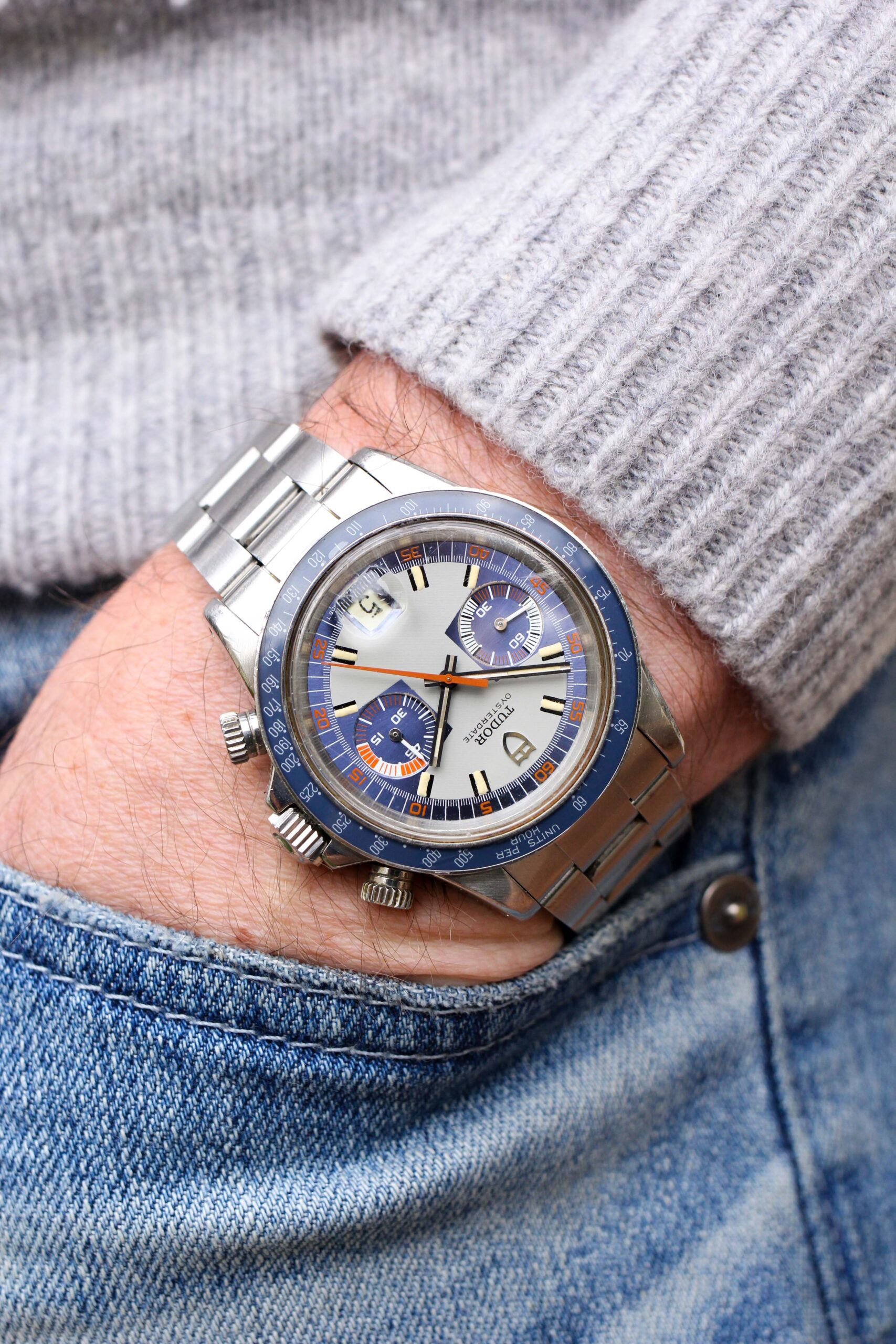
On the wrist, the Monte Carlo wears slightly taller than a modern Daytona, but they are well within the same size range. As you can see below, my 7″ wrists are a far cry from Arnold Schwarzenegger’s, but the reference 7149 looks great and is within what I would consider “appropriate” for almost all would-be wearers.

In addition to the Monte Carlo’s underrated wearability, the 7149 (in particular) is one of the most eye catching chronographs produced by Hans Wildorf during the glory years of the 1960’s and 1970’s. The fact that these early Monte Carlos haven’t fully entered the horological zeitgeist yet is not an indictment of their collectability…it just means people haven’t woken up to them yet.
Understanding the Reference 7149
To help you better understand where my blue reference 7149 fits into the world of Monte Carlos, I’ll quickly walk through the three series of vintage Tudor exotic chronographs:
I. 7000 Series
The references 7031 and 7032 (or the 7000 series) were the first chronographs offered by Tudor and were released in 1970. The design was big and bold – measuring 39.5mm in diameter compared to the 36mm Daytona, with large screwdown pushers, and a dial clad in an orange, grey, white, and black color scheme. The chronographs also utilized large hour plots that resembled a home plate from a baseball field, which gave way to the watches’ modern “Home Plate” nickname within the collector community. Both in 1970 and now, there is no mistaking these early chronographs, and they are highly coveted by Tudor collectors around the globe.

Reference 7032 (steel bezel); c/o Bulang & Sons
II. 7100 Series
Released just a year later in 1971, the second series of Tudor’s chronograph line (references 7149, 7159, and 7169) made several important changes to the design formula. One of the more underappreciated aspects was an upgraded movement, as the 7100 series utilized a Valjoux 234 with a column wheel chronograph (rather than the cam actuated Valjoux 7734 from the 7000 series) and a higher beat rate for greater accuracy (21,600 vph, versus 18,000 with the prior series).
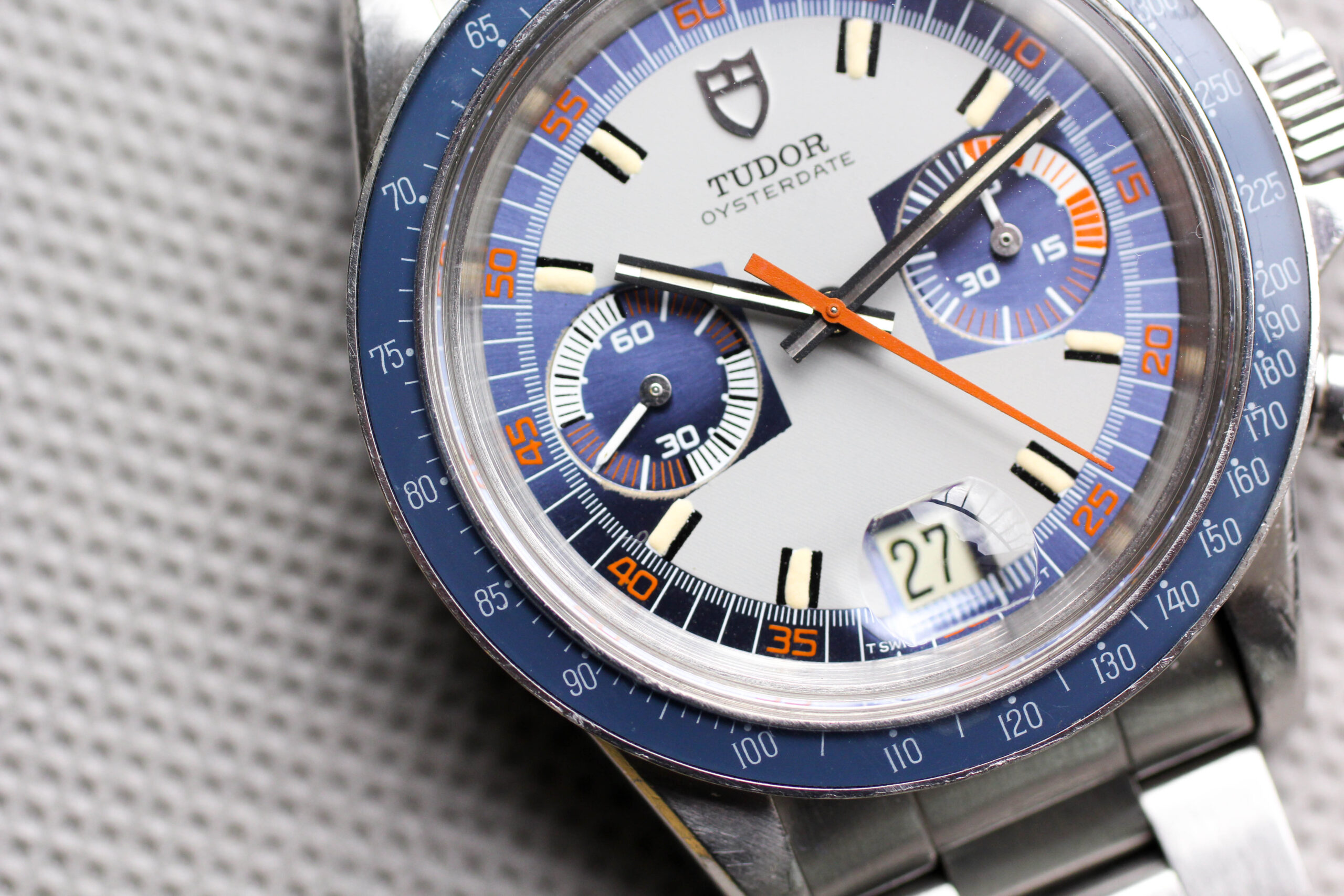
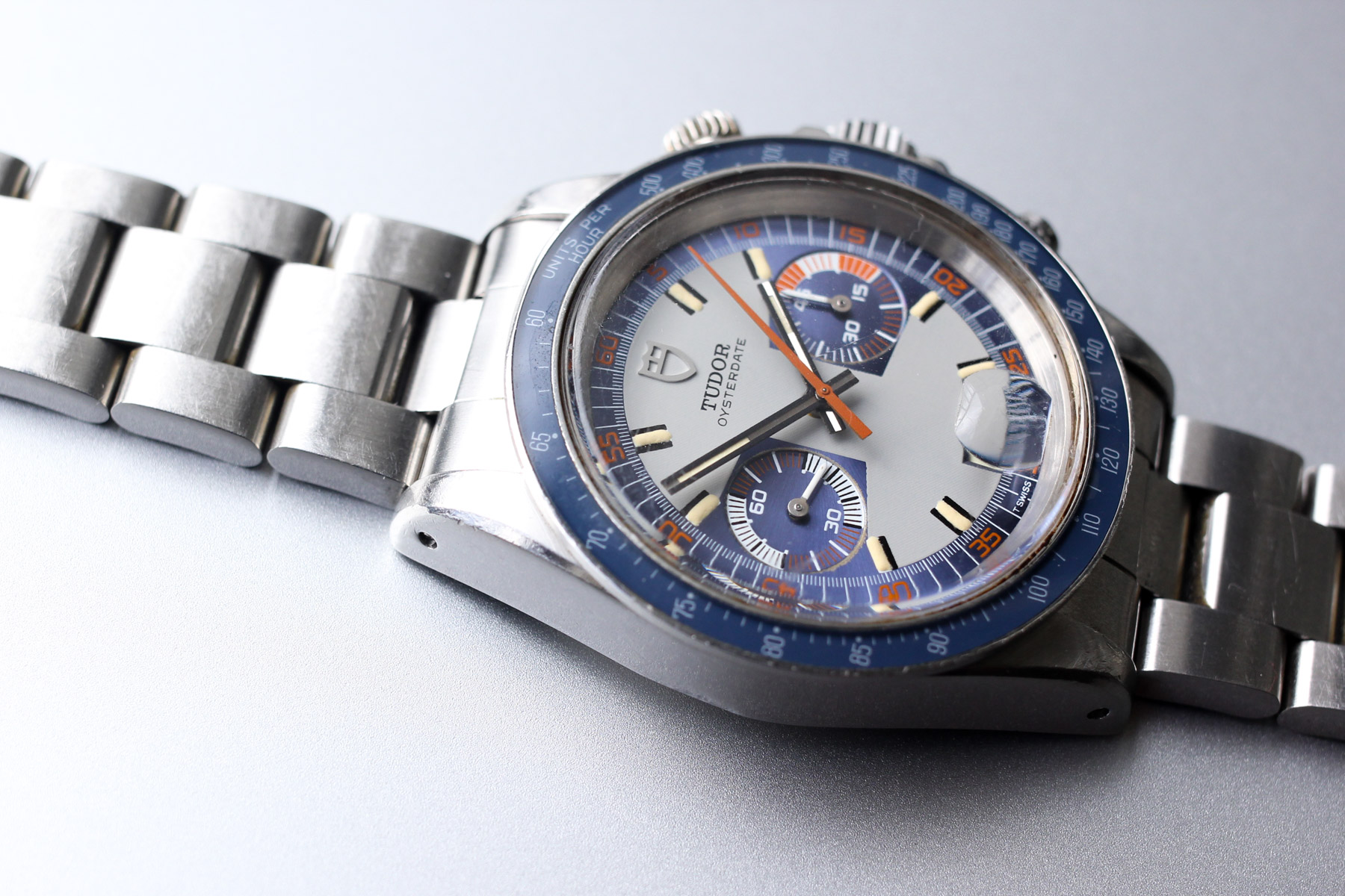
More noticeably, significant changes were made to the dial. Gone was the white minute track, replaced by a uniform track that nestled within the colored outer rim of the dial. Tudor also changed the “home plate” hour markers to a more staid, vertical strip of luminous material with black borders. Perhaps most obviously (given the titular watch and header at the top of this post), Tudor even added a blue dial for the first time, which featured a matching blue bakelite bezel.

But the single most important change to the design was the subdials, which featured a roulette / alternating pattern and made ample use of the existing orange and white color scheme. Tudor chronographs with these dials are now called “Monte Carlos” by collectors, and I personally find the design to be far more radical and eye catching than the 7000 series.

III. 9400 Series
The final iteration of “exotic” Tudor chronographs, the 9400 series, was introduced in 1976 and featured a self-winding movement (the first automatic chronograph produced by Hans Wildorf) and three subdials to allow for longer timing. Under the hood, the series utilized the self-winding Valjoux 7750, which necessitated large-scale changes to the design due to the movement architecture.
As seen on other Valjoux 7750 chronographs from the period, the three subdials are aligned vertically rather than horizontally, and while the aesthetic is similar to the prior 7100 series, the watches added significant height to accommodate the movement, increasing to a thickness of 14.5mm compared to 12.8mm for the 7100 series. While I find this final series interesting on a historical level, the combination of the added thickness and vertically aligned subdials renders this the least compelling exotic Tudor chronograph to me.

A reference 9430; c/o Menta Watches
The Story Behind My Tudor Monte Carlo 7149
I’ve often found that the best watches come around when you aren’t actually looking for them, which was true of the Monte Carlo in this post. I had owned my reference 7159 since 2016 (five years prior to the purchase of this 7149) and though the blue dialed Monte Carlo had been the catalyst that sparked my obsession with vintage watches, I was largely content with the 7159. That is, until my doom scrolling on Instagram led to an impromptu purchase.
One of the true changes to watch commerce over the past five years is how many high-priced watches change hands based solely on an Instagram post. One random day, a dealer that I had followed and known for some time posted a few pictures of a stunning 7149 that stopped my thumb mid-scroll. The watch showed honest wear but retained its original, wide case bevels. Most importantly, the dial remained in fantastic condition, the hands matched, and the bezel had faded to a slightly lighter hue than the metallic blues of the dial. Just as when I was researching the Heritage Chrono in 2013, I didn’t need the 7149 – but I sure as hell wanted it.

On top of the general condition of the example, this Monte Carlo also came with terrific provenance, as it was given to NHL hockey player Rick Paterson, a member of the Chicago Blackhawks from 1978-1987, by the Blackhawks’ TV affiliate. To make it even more personal, his letter of provenance noted that he received the watch in Water Tower Place, a well-known landmark in the city of Chicago.

My own past is strongly interlinked with the city of Chicago and I had lived around the corner from that very same building for three years, so upon learning the full story and seeing the letter from Rick confirming its accuracy, it felt like a perfect match.
In the year since buying it, the 7149 remains one of my favorite watches in my collection. It is quite rare, beautifully complex in design, and a joy on the wrist. Sleep on these watches at your own peril, as I believe they will eventually be recognized as foundational watches in the history of Tudor and will be highly sought after by a wider base of collectors than today.
